After the house is renovated, if you still find some regrets on the wall, ceiling, etc., but there is no extra time and money to redecorate, you can try to use soft clothing to make up for these defects. Today, Xiaobian on the system to explain the soft-packed knowledge for everyone, the speed of interest is horse! First, the difference between hard and soft 1. What is hard-wearing is generally refers to the wall, brush paint, ceiling, laying pipelines, wires, etc. in traditional home improvement. Generally speaking, in addition to the infrastructure that must be met, in order to meet the structure, layout, function, and aesthetic needs of the house, all the decorations added to the surface or inside of the building also include colors, which are in principle immovable. Second, the components of modern soft clothing are mainly divided into 1. Furniture, including supporting furniture, storage furniture, decorative furniture. Such as sofas, coffee tables, beds, dining tables, dining chairs, bookcases, wardrobes, TV cabinets, etc. Third, the five "balance" principle of soft furnishings <br> Balance style: layout jewelry to combine the overall style of the room, first determine the general style and color, according to this unified tone to layout is not easy to make mistakes. For example, for a simple home design, a design with a sense of jewelry is more suitable for the personality of the entire space, if it is a rustic style, it is suitable for natural and casual jewelry. Fourth, indoor soft-fit matching method 1. Proportion and size In aesthetics, the most classic proportion distribution is no more than the golden section. If you don't have a special preference, you can use the perfect ratio of 1:0.618 to make room space. This is a very easy way. For example, don't put the vase in the center of the window sill. Place it on the left or right side to make the visual effect a lot more active. However, if the entire soft-fit layout adopts the same ratio, it must be changed, otherwise it will appear too rigid. 4. The protagonist and the supporting role When the choice of the protagonist and the supporting angle is confirmed, the other arrangements are also logical, confirming that the protagonist is one of the basic factors to be considered in the soft installation. In the decoration of the living room, the visual center is extremely important. The scope of attention of the person must have a central point, so that the level of beauty of the primary and secondary can be created. This visual center is the focus of the arrangement. Five, the common eight misunderstandings in the soft-fit collocation 1. Too much acclaimed decorative lacquer decorative paint can add a touch of color to the space, but the key is to know the extent of mastery. The perfect finish is elegant and smooth, but the excess used will end with a vulgar effect. 5. The cheesy sofa shawl replaces the shawl that covers the sofa as a whole with a beautiful shawl. Keep the sofa simple and clean. Don't pile up a lot of fabric on the sofa. Sixth, soft color matching a. Soft color matching principle In soft clothing, color matching should start from the indoor overall color environment, grasp the color melody on the tone of the hard decoration main color, the general principle is to follow the big tune, Small contrast." The color tone is determined by the color patches that attract the most lines of sight. Generally for the ground, walls, ceilings, floor curtains, etc. The harmony and perfection of color is the combination of soft decoration and decoration based on the color tone. 3. Purple will give the space a sense of purple, giving people the feeling that it is quiet, fragile and slender, always giving people unlimited romantic associations, the pursuit of fashion is the most admired purple. However, a large area of ​​purple will make the overall tone of the space deeper, resulting in a sense of oppression. It is recommended not to be placed in a room that requires a cheerful atmosphere or in a child's room, which will make the person in it feel helpless. If you really like it, you can use it as a decorative highlight in the part of the living room, such as the corner of the bedroom, the curtain of the bathroom and other small places. 7. Orange will affect the quality of sleep orange or orange, is a vibrant, vibrant color, is the unique color of the harvest season. Using it in the bedroom is not easy to calm down, not conducive to sleep. But using orange in the living room creates a cheerful atmosphere. At the same time, orange has an appetite-inducing effect, so it is also the ideal color for decorating a restaurant. The combination of orange and chocolate or beige is also very comfortable, and the clever color combination is a bold attempt by young people who are looking for fashion. c. How to change the home soft color room according to the environment and space can create different seasons and seasons through the color tone in the soft decoration, such as winter, you can choose warm colors such as orange, pink, light yellow to create a warm home, while embellishing a few A cool color system that emphasizes warm colors. In the summer, you can change to a cool color, such as light blue, lavender, green and so on. The living room is a place for family and visitors. new born baby car seat, baby car seat, infant car seat, baby car safety seats, car seat for little baby NINGBO BABY FIRST BABY PRODUCTS CO.,LTD. , https://www.maxinfglobal.com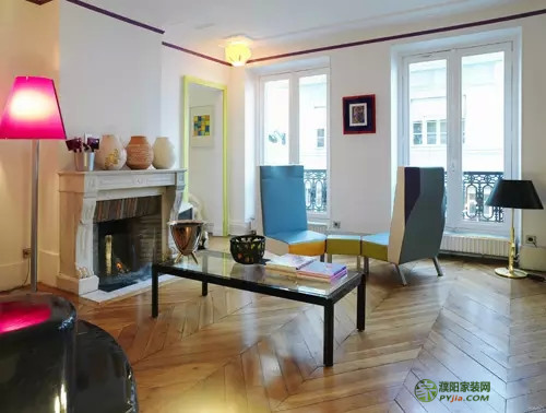
2. What is soft and soft is an emerging concept, which further subdivides the decoration. The so-called soft decoration refers to the decoration, such as the floor, ceiling, wall and door and window, which are fixed and can not be moved in the interior decoration. In addition, other movable, easy-to-replace accessories such as curtains, sofas, cushions, wall hangings, carpets, bedding, lamps, etc., as well as decorative crafts, living room plants, etc., are the second furnishings and layout of the living room.
3. The difference between hard and soft clothes In the modern sense, the soft clothes can't be separated from the hard ones. People hardly separate the hard and soft design, largely because the two are in the construction. However, in terms of application, both are to enrich the conceptual space, to alienate the space to meet the needs of the home, and to display the personality of the person.
Soft and hard are interpenetrating. In the modern decorative design, wood stone, cement, ceramic tile, glass and other building materials and silk and other textiles are intertwined, infiltrated with each other, and sometimes they can be replaced. For example, for the decoration of the roof, people tend to stick to the hard materials such as wood and plaster. In fact, using a silk fabric to make a film in the upper space of the room, pulling out a beautiful arc, not only will play the role of alienation space, but also a little mysterious oozing out, become the highlight of the whole room. 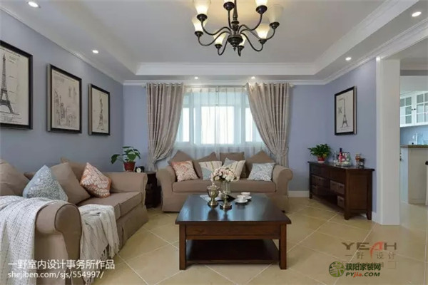
2. Jewelry, generally ornaments and pendants, including crafts ornaments, ceramic ornaments, bronze ornaments, wrought iron ornaments, hanging paintings, illustrations, photo walls, photo frames, lacquer paintings, murals, decorative paintings, oil paintings, etc.
3. Lighting, including chandeliers, standing lights, table lamps, wall lamps, spotlights. Lighting not only plays the role of lighting, but also reflects the atmosphere of the environment and enhances the indoor atmosphere.
4. Fabric fabrics, including curtains, bedding, carpets, tablecloths, table flags, cushions, etc. A good fabric design can not only improve the indoor grade, but also make the interior warmer and reflect the taste of a person.
5. Floral and green landscaping, including decorative flowers, flowers, dried flowers, flower pots, art flower arrangements, green plants, bonsai gardening, water features, etc. 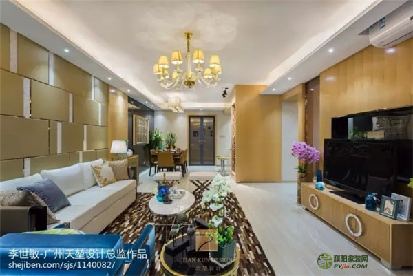
Balanced varieties: In the home accessories, each season has different materials of home fabric, whether it is a colorful print, or a gorgeous silk, romantic lace, just change the different styles of home fabric, you can change the difference The home style is more economical and easier to replace than replacing the furniture.
Balanced color: The color of the fabric should be unified to enhance the overall sense of the room. The hard lines and cool colors in the decoration can be softened with fabric. In the spring, choose the fresh flower pattern to make the room spring. In the summer, the fruit or flower pattern will make people feel refreshed; in autumn and winter, you can change the pillow and warm the winter.
Balanced position: To balance home accessories and make them part of the visual focus, symmetrical balance is important. When there is large furniture next to it, the order of arrangement should be high to low to avoid visual discomfort. It is also a good choice to keep the center of gravity of the two ornaments consistent. Place two lamps of the same style side by side, which not only creates a harmonious rhythm, but also gives people a warm and warm feeling.
Balanced quantity: When people are planning a new home, they often want to show everything. In fact, there is no need to do this. Putting out the ornaments will make the room lose its character and personality. You can classify the jewelry first, put the same attributes together, and then change according to the season or festival to change the mood of different homes. 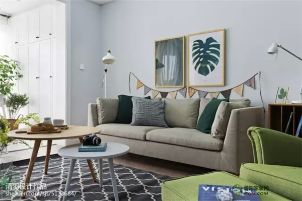
2. Stable, lightweight, stable and lightweight match is available in many places. Stability is the whole, and lightness is partial. If the soft furnishings are too heavy, it will make people feel depressed. If they are too light, they will feel frivolous. Therefore, when you are soft-packing, you should pay attention to the combination of color and weight, the coordination of shape and size of furniture accessories and the reasonable improvement of the overall layout. .
The use of bright colors and slim decoration in the interior, the pursuit of light and slender beauty. For example, yellow, green, and light gray are the main colors in the living room. Gray has always given people a sense of stability and elegance, yellow dilutes the dullness of gray, and green neutralizes the dazzling yellow, all arranged in order to finally form a perfect unity of stability and lightness.
3. Contrast and Harmony In the home layout, the use of contrast techniques is everywhere. Designers can create more levels and more styles of home style through light and dark contrast of light, contrast of color and contrast, contrast of materials and contrast between traditional and modern, thus creating a variety of different rhythm lifestyles.
Reconciliation is an effective means of buffering and blending the two sides. For example, the use of warm colors and soft fabrics. If you have a unique taste and go for it, then if you use a strong contrast, choose a softer one. 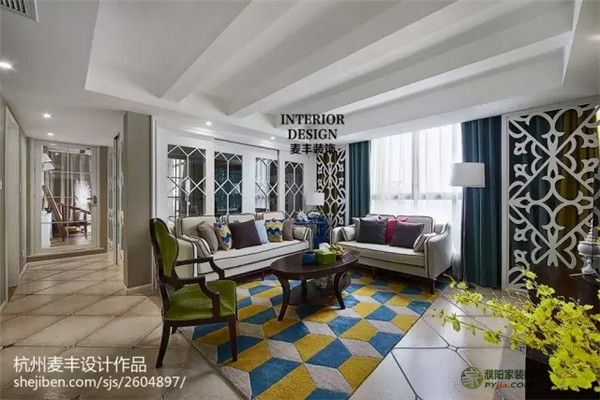
Emphasis on a certain part can break the global monotony and make the whole room become energetic. But one of the visual centers is enough, just like a stone thrown into the calm water, creating a wave of ripples, which will make people think. If you choose a unique chandelier in the living room, you can't add too many visual centers. Once the supporting role exceeds the protagonist, it is easy to make mistakes.
5. Unification and change The layout of soft furnishings should follow the principle of diversity and unity. According to the size, color and position, it can be integrated with furniture to create a harmonious and vitalistic unity and change. Furniture should have a uniform style and charm. It is best to customize or choose soft decorations with the same color and style. Together with the details of the humanities, the taste of the living environment is further enhanced. For example, the yellow color that contributes to the appetite can be set as the main color of the restaurant, but a blue-green decorative painting is hung on the wall as a change in the overall color tone. 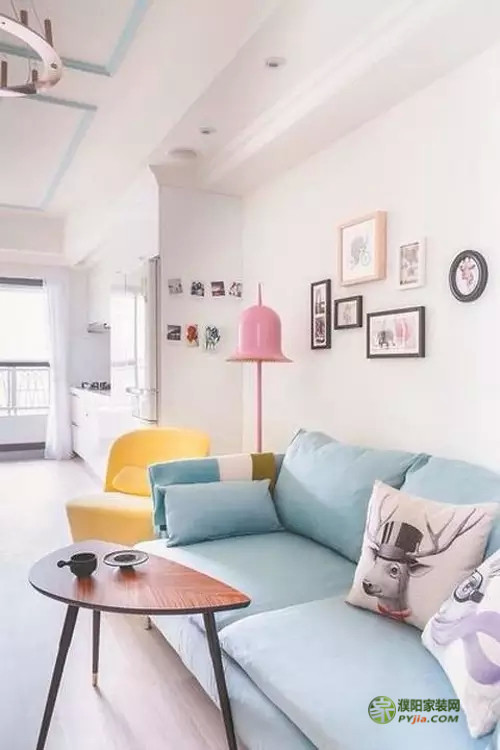
2. The fake flower is very controversial, but the use of fake flowers is indeed a mistake. They can't bring indoor vitality like beautiful scented flowers, they only bring dust.
3. Use too many pillows If the pillows prevent you from sitting comfortably on the sofa or lying on the bed, it appears too much. Put your time on the pillow!
4. Too many small furnishings, decorations, accessories, etc., whatever you want to call them, each of us will have a lot of these things, but all of them show up, people who are intensive phobias... 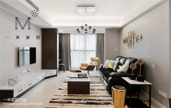
6. The picture frame is too high. If you want to look up and enjoy your art, it means that it is hanging too high. Whether you are sitting or standing, you usually don't want to look up to appreciate your art. The best height is the height of your eyes. There is a good rule to remember: If you are hanging behind the sofa, keep the bottom of the frame 15 cm away from the back of the sofa.
7. The restrained pillow should not use the pillow that is too "show", making the layout of the living room pillow too formal. Each pillow is designed to be styling, because the well-designed pillow posture is extraordinarily unnatural in reality.
8. Ignore window sheets and blankets are for bed use, not windows. Window coverings not only represent the end of a room decoration, they are as important to a room as jewelry is to women. In addition to paint, window coverings are the easiest and cheapest way to change the look and feel of the entire room. 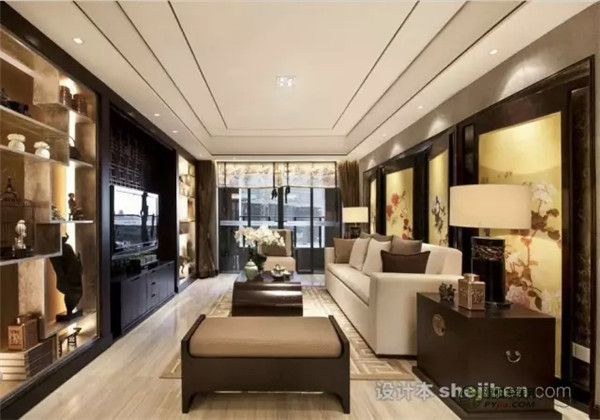
The color of the overall layout and the color of the partial layout also have different effects. Although the room is pure and white, it is refreshing and clean, but it has been monotonous for a long time. In order to make the whole room more heated and not monotonous, you can add some plush carpets, sheepskin and other warm accessories in the room, and replace the soft cover in black and white with yellow and orange wavy lines. Color strips and striped patterns accent the accents to make the room brighter.
b. Soft decoration color matching notes 1. Do not decorate the restaurant blue with blue, it is a kind of delusional color. Traditional blue is often the embodiment of the tropical style of modern decorative design. Blue also has the effect of regulating nerves, calming and calming the nerves. The blue is fresh and elegant, and it is also very eye-catching with various fruits, but it should not be used in restaurants or kitchens. The food on the blue table or placemat is always better than the appetite in warm colors. At the same time, do not install incandescent lamps in the restaurant. Or blue mood lights, scientific experiments have shown that blue light will make food look unattractive. However, as a bathroom decoration, it can enhance mystery and privacy.
2. The black and white room is very modern and is a choice for some fashion people. However, if you use black and white in the room, it will be too fancy. In this environment for a long time, it will make people dazzled, nervous, and irritated, making people feel at a loss. It is best to use white as the main part, and the other parts are decorated with other colors. The space becomes bright and comfortable, and at the same time it has both taste and fun. 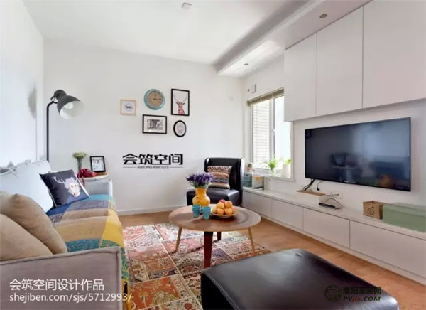
4. Pink will bring irritating emotions to pink, and it is easy to make people feel annoyed when used in large quantities. In order to adjust the atmosphere of the new home, some newlyweds like to make romance with pink. However, the thick pink will make people's spirits always in a state of excitement. After a period of time, the people who live in them will have an inexplicable heart, easy to squabble, and cause irritability. It is recommended that pink appear as an embellishment of the interior decoration, or dilute the concentration of the color, and a light pink wall or wallpaper can make the room warm.
5. Red can't be used as the main color of space for a long time. Chinese people think that red is auspicious. From ancient times to now, the newly-married wedding houses are full of red eyes. Red also has a passionate, unrestrained meaning, full of burning power. However, too much red in the room will make the eyes overburdened and cause dizziness. Even if it is newly married, it will not be able to leave the room in red for a long time.
It is recommended to choose red for soft decoration, such as curtains, bedding, bags, etc., and with a light beige or fresh white, can make people refreshed and more prominent red festive atmosphere.
6. Don't use a single golden decoration to decorate the room with golden brilliance, showing a bold and flamboyant personality. Under the simple white background, the vision will be very clean. But gold is one of the most easily reflected light colors. The golden environment is the most harmful to people's sights. It is easy to make people nervous and not easy to relax.
It is recommended to avoid the use of a single golden decorative room on a large area, which can be used as a decorative color on wallpapers and soft curtains; on the bathroom wall, a golden mosaic can be used with cool white or stainless steel. In order to make the environment of the living room more affable, you can put some green potted plants in the corner to make the room full of fun. 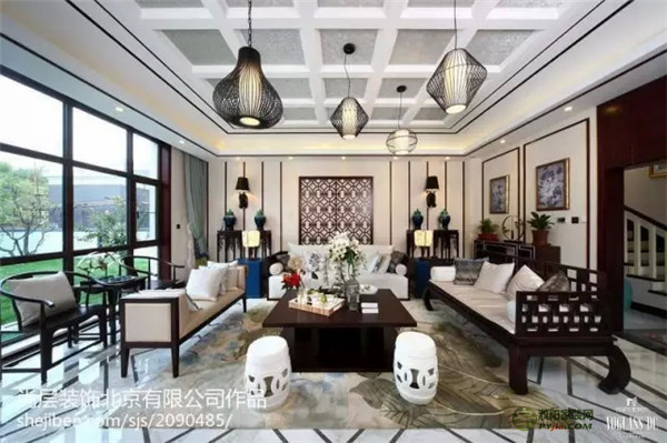
8. Don't use yellow and yellow in the study, cute and mature, elegant and natural, making this color system popular. The fruit yellow has a gentle character; the butter yellow exudes the motive force; the golden yellow brings warmth. Yellow also has a calming effect on appetite for healthy people. However, long-term exposure to high-purity yellow will give people a feeling of laziness, so it is recommended to embellish some in the living room and restaurant. Yellow is the most unsuitable for use in the study, which will slow down the thinking.
9. Black avoids the use of black in a large area. It is a water in the five elements. It is quite a quiet color, so no one will decorate the bedroom wall with black. Many people use it in the bathroom, but also pay attention to the proportion. It is recommended to embellish the appropriate gold in a large area of ​​black, which will be both calm and luxurious. It is a timeless classic with white. When it is matched with red, the atmosphere is intense and hot. Generally, the purity should be higher on the jewelry. The red embellishment is mysterious and noble.
10. Brown is not the ideal color for restaurants and children's rooms. The brown color is neutral and warm, it is elegant, simple, solemn and elegant. It rejects the cheesy of gold tones, or the monotony and mediocrity of ivory. Coffee itself is a more subtle color, but it will make the restaurant dull and melancholy, affecting the quality of the meal; it should not be used in children's rooms, the dull color will make the child's character depressed; also remember that brown is not suitable for black . In order to avoid dullness, you can use white, gray or beige as the fill color to make the brown color play its brilliance. 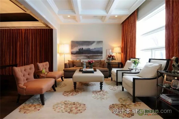
The color selection embellishment needs to promote the bright and perspective space of the place; the restaurant should use a simple and refreshing soft decoration to create a comfortable dining environment, and use warm colors to enhance appetite; the study is a place for reading, self-cultivation and love. A mood of peace and mood is set against the mood. These large environments are not only independent soft environment carriers, but also have their own color matching requirements. There is a certain relationship between their respective color requirements and the main color. If they are purely considered from their respective color requirements, it is easy to cause the overall environmental color. The situation of contrast.